Artwork Guidelines

Finished Artwork

For artwork to be considered finished, the following guidelines must be followed:

  1. Artwork must be in a .png file format.
  2. Artwork must be 300 DPI.
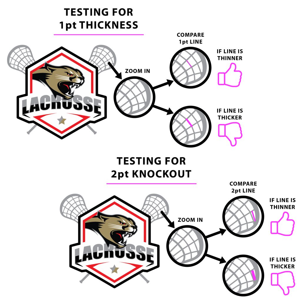
  3. Minimum line thickness for our Standard Transfer is .014” (or 1 point). We also request that the minimum knockout space be .028” (or 2 points).

1-Point Stroke/Fonts/Glows

Glows or fades on the edges or around fonts and graphics (such as fades, glows, gradual fades from solid color to nothing) typically do not print well as the computer has to calculate how much white to print behind the transition, and most of the time does not do well with it. Glows or fades within the artwork inside the perimeter of another graphic print fine. Glows that fade to no background is where you will have issues in appearance. When in doubt please submit a test print to see how your design prints.

Stroke Thickness & Font Thickness

All strokes in artwork must be at least 1-point to ensure the design prints properly for our standard transfers. Lines and Fonts that are too thin may not take adhesive readily and not release from the film effectively.  If you have stokes, details or fonts that are less than 1/8″ in thickness, we highly suggest a test print to see how the artwork prints and presses before ordering in bulk.  When in doubt send a test print to verify.

Checking Stroke / font Thickness

Testing your image for best printing results.

2-Point Knockout

Knockout Space

All strokes in artwork must be at least 1-point to ensure the design prints properly for our standard transfers.

Checking Knockout Space


Individual Names and Raster Types

  1. Supply the list of names typed in a Microsoft Word® or Notepad document as you want them printed. We DO NOT accept Microsoft Excel® documents.
  2. Please do not layout names in Microsoft Word® or Notepad with multiple columns, rows, or headings. Send it with a single column list. If you would like to show us how you want the list laid out for a Custom Transfer order, supply both the layout file and a single column list file..
 

RASTER vs VECTOR

Bitmap images, also referred to as raster images, are made up of a collection of dots or pixels in a grid. Because bitmap images can produce painterly effects, they can be photographic in nature. Bitmap images are defined by the number of pixels in the image (called resolution) and the number of colors contained in the file (called bit depth). The resolution of a bitmap file is usually measured in pixels per inch (ppi) and is set when the image is created. For example, when you take a digital picture, scan a piece of art, or create a digital painting, you define what the resolution of that image will be. If an image has a high resolution, the individual pixels are smaller and, hence, give the image a greater level of detail. In extremely low-resolution images, the individual pixels might even be large enough to see, resulting in stair-step patterns, also known as jaggies. When bitmap images are enlarged, the pixels are just made larger. For example, if you take a 300 ppi image and enlarge it 200%, the effective resolution on the file is 150 ppi.

In contrast, vector images are made up of paths, called bezier paths, that are defined mathematically. These paths were originally developed for designing cars and airplanes. The paths use anchor points and control handles to define the position and behavior of paths on an x,y axis, which gives you the ability to create free-flowing shapes that are clean and sharp. Because the anchor points on these paths are defined as mathematical coordinates, they are resolution-independent and can be scaled to any size without losing quality or appearance. In addition, working with distinct objects and paths makes it easier to create and edit artwork. For these reasons, vector images are perfect for logos, maps, and other artwork that must remain in a scalable and nondestructive form like screen printing.

DTF Michigan accepts PNG-based raster files for printing.